Fountain? Heart? ‘KC’? Kansas City officials’ rebranding effort can’t please everyone

Pop quiz: What is the official logo of Kansas City?
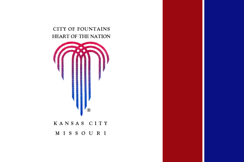
Is it that heart you see everywhere — the one on Charlie Hustle shirts and the mayor’s lapel and, as of last month, at more than 150 public locations scattered across the city?
Is it the vaguely heart-shaped fountain found on manhole covers and recycling bins?
Or is it the “KC” design that looks like the old Kansas City Monarchs logo, seen on the city’s trash trucks and prominently featured on its website?
The technically correct answer is the fountain. But all that really means is it’s the seal used on formal city business.

You’re just as likely to see a snow plow or social media page marked with the Monarchs-style logo, which the city’s leaders opaquely defined as a “moniker” when it debuted in 2013.
Or you were. The city is retiring the moniker, spokesman Chris Hernandez tells The Star.
“The KC moniker has fulfilled its goal of engaging the public and been successful in elevating the level of pride in our city,” Hernandez says. “But after 8 years, it’s time to refresh our look.”
The city is in the process of rolling out a new logo that’s essentially the fountain logo, but with stronger lines and “Kansas City Missouri” written in bold font in the middle. The idea is that this new logo will eventually replace the KC moniker everywhere, reining in the municipal branding free-for-all.
“We’re not calling it a rebranding, because we’ve had the fountain logo for years,” says Hernandez. “We have simply freshened it up.”
The abandonment of the moniker amounts to a (literally) symbolic reversal of a trend initiated by former Mayor Sly James. It was introduced in 2013, and not without controversy. Detractors said it looked like a cattle brand or a shirt monogram, or too much like the actual Monarchs logo. City Council members groused about not being consulted.
“Who died and made them king?” former Councilman Ed Ford asked about the communications department’s decision to launch the moniker.
Though a coherent explanation of the difference between the city’s logo and moniker remained elusive, it quickly became clear that the moniker was on a steady, and perhaps stealthy, march to replace the fountain logo. It was plastered all over the city’s new website and TV channel, and its open-source design meant that everyone in Kansas City was free to use it as a symbol, for anything from an amateur softball team to a custom-printed coaster.
“Sly wanted something that honored the city’s roots while being more recognizable and more accessible for mobile and web and apps,” says Emily Elmore, the designer of the moniker. “We did a lot of community outreach and had a lot of conversations as part of the process, and one thing we learned is that a lot of people don’t really know what the fountain logo is or what it signifies.”
The moniker, on the other hand, was straightforward: a big K and a big C. Mayor James loved it. “At the end of the day, you want something that when people look at it, they say Kansas City, boom, it jumps right out at them,” he told The Star shortly after it was unveiled.
Elmore, whose design and marketing firm Single Wing Creative often contracts with the city, said her understanding was that the goal was to eventually “incorporate (the moniker) into everything, to integrate it further and further” into the city’s imagery. She attributed the demise of her creation to a couple of carpetbaggers.
“There are two people in City Hall who really hated (the moniker), and they’re new here — they’re not from Kansas City,” Elmore said.
Where are they from?
“They come from New Jersey. How’s that?”
Two people in City Hall who fit that description are City Manager Brian Platt and Assistant City Manager Melissa Kozakiewicz, both of whom arrived from the Garden State in the past year. Kozakiewicz, the project lead on the city’s “refreshed” look, did not respond to a request for comment.

The desire to streamline the city’s branding has caused a bit of turbulence out at the Aviation Department of late. The mayor’s office recently nixed a long-in-the-making design the marketing agency Trozzolo prepared for the new airport, according to multiple sources, because it would have been inconsistent with the new logo.
Trozzolo chief marketing officer Josh Brewster didn’t offer up much in an email to The Star.
“We are partnering with the Aviation Department to develop a brand identity for the new airport terminal, which hasn’t been unveiled yet,” he wrote. “Other than that, you’ll have to check with the city for more info!”
Justin Meyer, deputy director of the Aviation Department, characterized the city’s involvement in the airport’s marketing as more collaborative than totalitarian, saying, “The city’s interest in improving its brand positioning aligns with us wanting to improve the visibility of our airport system.” Meyer added that the department hopes to roll out its new and improved branding sometime in the first half of this year.
In the meantime, fountain logo 2.0 is slowly being integrated into various city channels, including its official Facebook page and its Twitter account. You’ll be seeing it everywhere before long, said Hernandez, whose email signature still contains the KC moniker.
“Yeah,” he said, “I’ll be changing that soon, too.”

This story was originally published April 4, 2022 at 5:00 AM.