Confused by COVID-19 data? This cheat sheet has 3 numbers to watch during reopening
Even Jennifer Tolbert, a director of state health reform at the Kaiser Family Foundation, struggles to explain to friends how to make sense of the vast amount of data surrounding the coronavirus pandemic.
And that’s even after she has worked closely with state level health data before COVID-19 presented the public with a daily barrage of case numbers, testing statistics and death tolls.
The numbers are reported differently by states and local governments, and change as the situation evolves. It can be difficult to parse the metrics.
One thing experts agree on: A surge in coronavirus infections is expected this summer as more places reopen to visitors and people return to gathering in crowds.
To help create a guide for the average person to make sense of it all, The Star sought advice from experts on both sides of the state line. In interviews, Tolbert, Kansas Department of Health and Environment Secretary Lee Norman, Kansas Health Institute Senior Analyst Charles Hunt and Enid Schatz the chair of the University of Missouri’s Public Health department, explained what information is most useful for making personal decisions and judging whether COVID-19 is getting better or worse in their communities.
The experts pointed to a variety of metrics while warning that no one figure should be looked at in a vacuum. They cautioned that conditions in the pandemic are shifting over time.
“The information we have is changing so rapidly because we’re kind of building the plane as we fly it,” Schatz said, also noting that cases are going undetected even in areas with low numbers. “It’s here, it’s in our communities and we need to be able to understand and think about those cases.”
The most useful metrics come from data available online through public health agencies. But they may require the reader at home to do some of their own math.
Here are three measurements that can help explain the trend and severity of the virus in your community:
Positivity rate
One metric to watch is the percent of coronavirus tests run in the past seven days that came back positive.
Ideally, Tolbert said, that number should be 3% or lower.
The number can provide an idea of who is able to obtain a test in a given area.
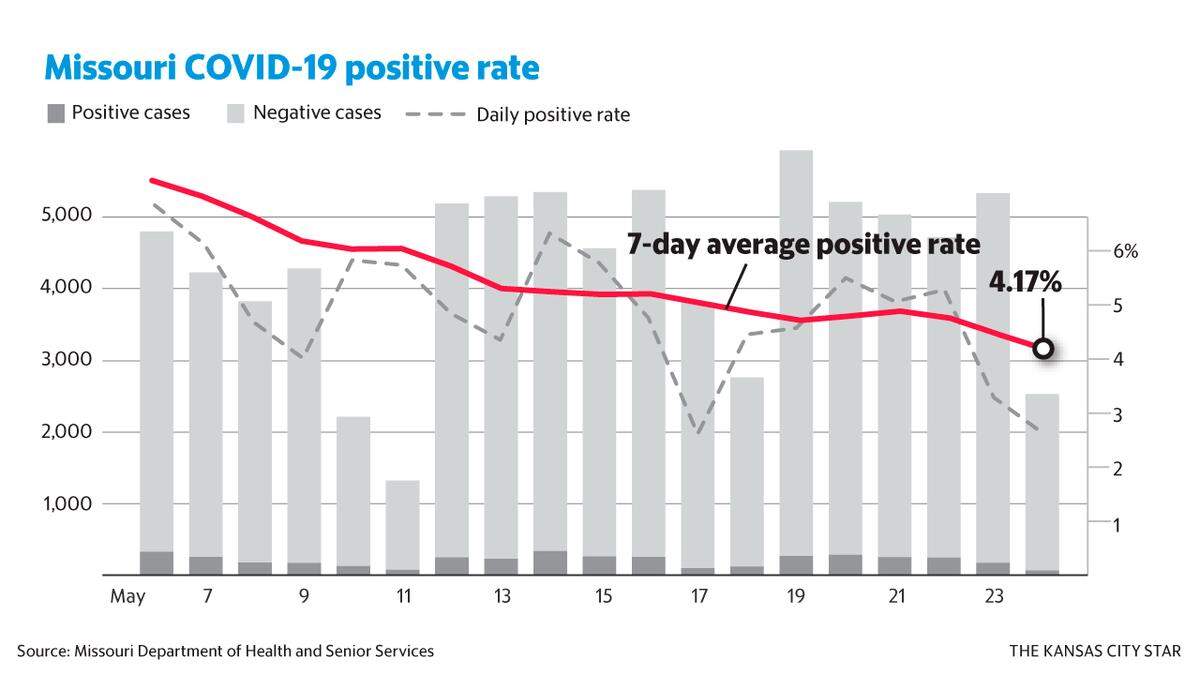
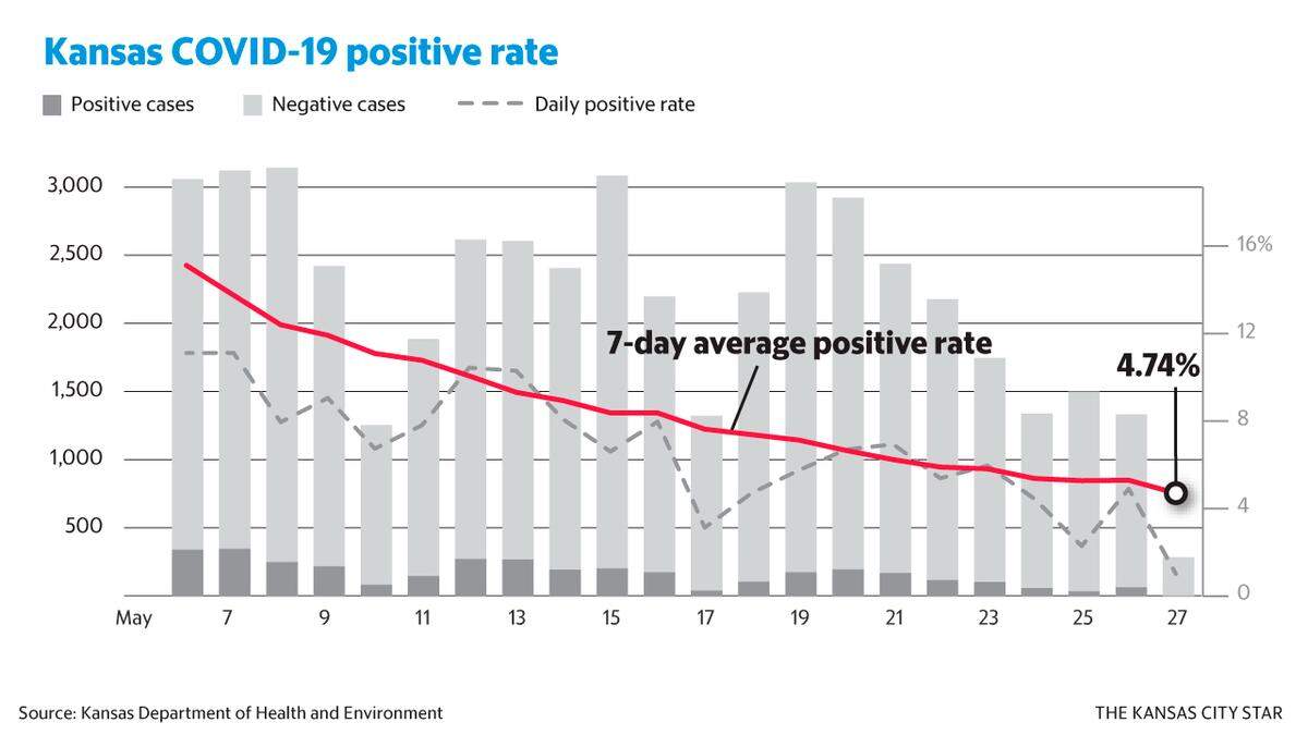
When the percent of positive cases is lower, Tolbert said, it indicates that more tests are being done and that testing is easier to obtain. At the beginning of the outbreak, testing was only available to those who had contact with a confirmed case or traveled to a high-risk area. As testing resources are expanded, however, states and localities are able to offer testing to others.
As a result, Tolbert said, the percent of positive tests should decrease because more asymptomatic people are tested for the virus.
The more testing is done in an area, Tolbert said, the better idea public health officials and the general public will have about where outbreaks exist and how widespread the virus is.
If more testing is being done and the positivity rate increases, Hunt said, that is a sign that transmission could be increasing in an area.
Another testing measure is the percent of an area’s population that is tested each week. Ideally, Tolbert said, jurisdictions should be aiming to test at least 1 percent of their population every week.
According to data posted on state health department websites Missouri and Kansas are each testing about half a percent of the state population each week. For the week of May 17th, Kansas tested a slightly higher number of their citizens at .69 percent.
Rate of case increase
Until the pandemic is over, the overall number of cases will continue to increase.
However, information can be gleaned from the rate of increase in cases over a 7-day period.
In general, this number decreasing is an indication of the virus spreading more slowly.
Norman said consumers of the data should look about three days back to get an accurate picture. The state tracks new cases based on symptoms onset — not based on when test results come back.
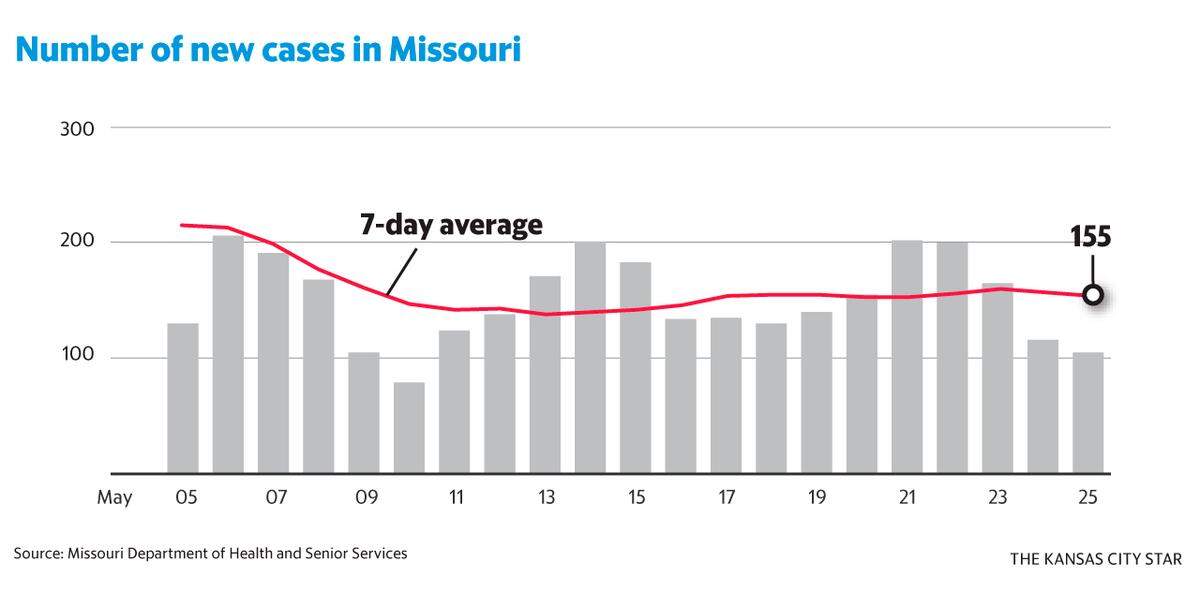
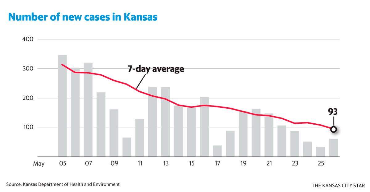
This means a quick glance at the chart will always make it appear as if the curve is trending downward.
From there, it is best to look at the trend over the course of the previous ten days.
“We’re always looking through a rear-view mirror,” Norman said.
The danger of relying solely on this metric, however, is that it is “muddied” by testing numbers, Norman said. If testing has increased dramatically, it may also lead to a dramatic increase in confirmed cases. And the number of new cases detected could also plummet if testing decreases.
For personal decision making, Hunt said, it can be helpful to look at the number of new cases by ZIP code.
Schatz said that she views this as the most useful metric for personal decision making. However, she said people should not assume that the numbers reported are the only instances of the virus in the community.
Even if low numbers are reported, Schatz said, it is safe to assume there are undetected cases.
Hospitalization
As people in the United States began to recognize the impact of the pandemic and stay-at-home orders were imposed across the nation, much conversation focused around “flattening the curve.”
This idea, Norman said, was not about reducing the number of cases we would see but spreading it out over a longer period of time so that, hopefully, some could be avoided as treatment and vaccines were developed.
Furthermore, Tolbert said, this would prevent the overwhelming of medical capacity in the country.
Therefore, Norman and Tolbert said, the number of hospitalizations per capita can be used to understand the severity of the situation.
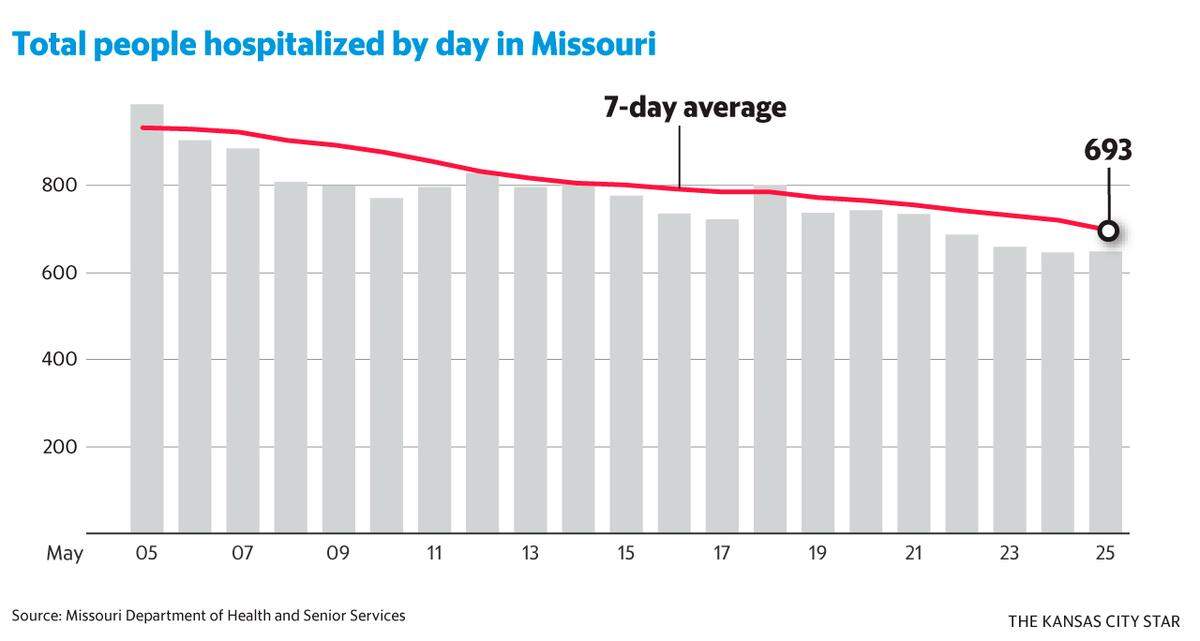
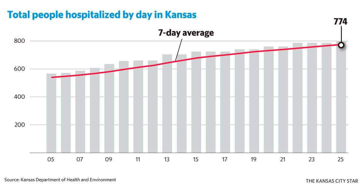
Norman and Hunt said this is one of their preferred metrics because it is not affected by testing inconsistencies. For the most part, Norman said, hospitals can confidently say how many people have been hospitalized with the rapidly spreading virus. Unlike rate of case increase, the number is not dependent upon testing availability and fewer cases go undetected.
Though there are many metrics available for hospitalization, Norman said he uses hospitalizations per capita.
Schatz, however, said she is more likely to look to the percentage of hospital and ICU beds in use because it shows how close the hospital systems in an area are to being overwhelmed.
Tolbert said the Kaiser Foundation does not use hospitalization data because it is not accessible for every jurisdiction nationwide.
Norman and Hunt said death rate is another metric that is insulated from testing data. Tolbert, however, said that number is indicative of the situation several weeks earlier when those who died were infected, not the current trend.
Data-based decisions
The variations in how data is reported from jurisdiction to jurisdiction mean that residents must pay close attention to the fine print, Tolbert said.
Small adjustments in what is reported, such as when Missouri announced antibody tests had been combined with viral tests in statewide data, can alter the picture.
“I would caution people that how the data are presented makes a difference,” Tolbert said.
Furthermore, people should be cautious about making day-to-day decisions based upon the data. Information about people diagnosed today with COVID-19 could be representative of someone who was exposed as much as 14 days ago.
Therefore, the impact of changes in policy or mass flouting of rules such as what was seen at the Lake of the Ozarks over the Memorial Day weekend will not be seen in data for at least 10 days
There is no bright line in the metrics where everyone will be able to just return to normal, Norman said. He said the best approach is a graded response looking at trends over time and relaxing restrictions slowly.
He and Hunt said they anticipate a resurgence of the virus over the summer. Even assuming that we’ve only detected about 10 to 25 percent of the cases of COVID-19, Hunt said, only about 1 percent of the population in Kansas has been infected. This means that as reopening efforts move forward the vast majority of the population remains vulnerable to the virus.
Norman said he doesn’t expect a return to what was considered normal until a vaccine is developed.
Until then, he said, people should continue to wear masks when they cannot control their environment
BEHIND THE STORY
MOREHow we did this story
The Star sought to create a guide for members of the public to understand the statistics surrounding the coronavirus pandemic. It is meant to help readers at home follow the progress of public health efforts to deal with the spread of the disease. A reporter reached out to academics, public health officials and researchers to ask what are the most useful numbers for making decisions in daily life.
The data comes from these public health websites:
Kansas: coronavirus.kdheks.gov
Missouri: mophep.maps.arcgis.com
Kansas City: .kcmo.gov
Jackson County: experience.arcgis.com
Johnson County: public.tableau.com
Wyandotte County:/experience.arcgis.com
Clay County: mophep.maps.arcgis.com
Platte County: mophep.maps.arcgis.com